Built to Convert
Wyspur sells a high-touch B2B sales service. The methodology was real, the team was strong, and the results were there, but the presentation was lagging. For a buyer evaluating a recurring engagement, that gap matters. The site is the first piece of evidence about how seriously a company takes its own work, and it can’t afford to tell a different story than the service does.
The brief was to close that gap. The actual work was figuring out what Wyspur was really selling, and building something that made a serious buyer feel like they’d found the right partner.
01 Substance Before Structure
Wyspur came in with a detailed documentation of their process: frameworks, flowcharts, proprietary methodology. All of it genuinely impressive in its depth, but ultimately built for internal use. None of it was presented in a way that drives a prospect to act.
Internal documentation and external persuasion are organized around different questions. The flowcharts showed how Wyspur operated and why. What a prospect needs to understand is why that matters to them, in the order they need to hear it. Pulling those apart: identifying what belonged in positioning, what belonged in proof, what belonged in process, was the first order of business.
The work was learning to read methodology the way a prospect would, and rebuilding around that reading.

02. Less Surface, More Signal

A three-page site has its own set of challenges. There’s no hierarchy to get lost in, no catalog to wade through. The risk is quieter: when everything gets equal billing on limited real estate, the cumulative effect is cognitive noise rather than clarity, and noise at the wrong moment creates doubt rather than confidence.
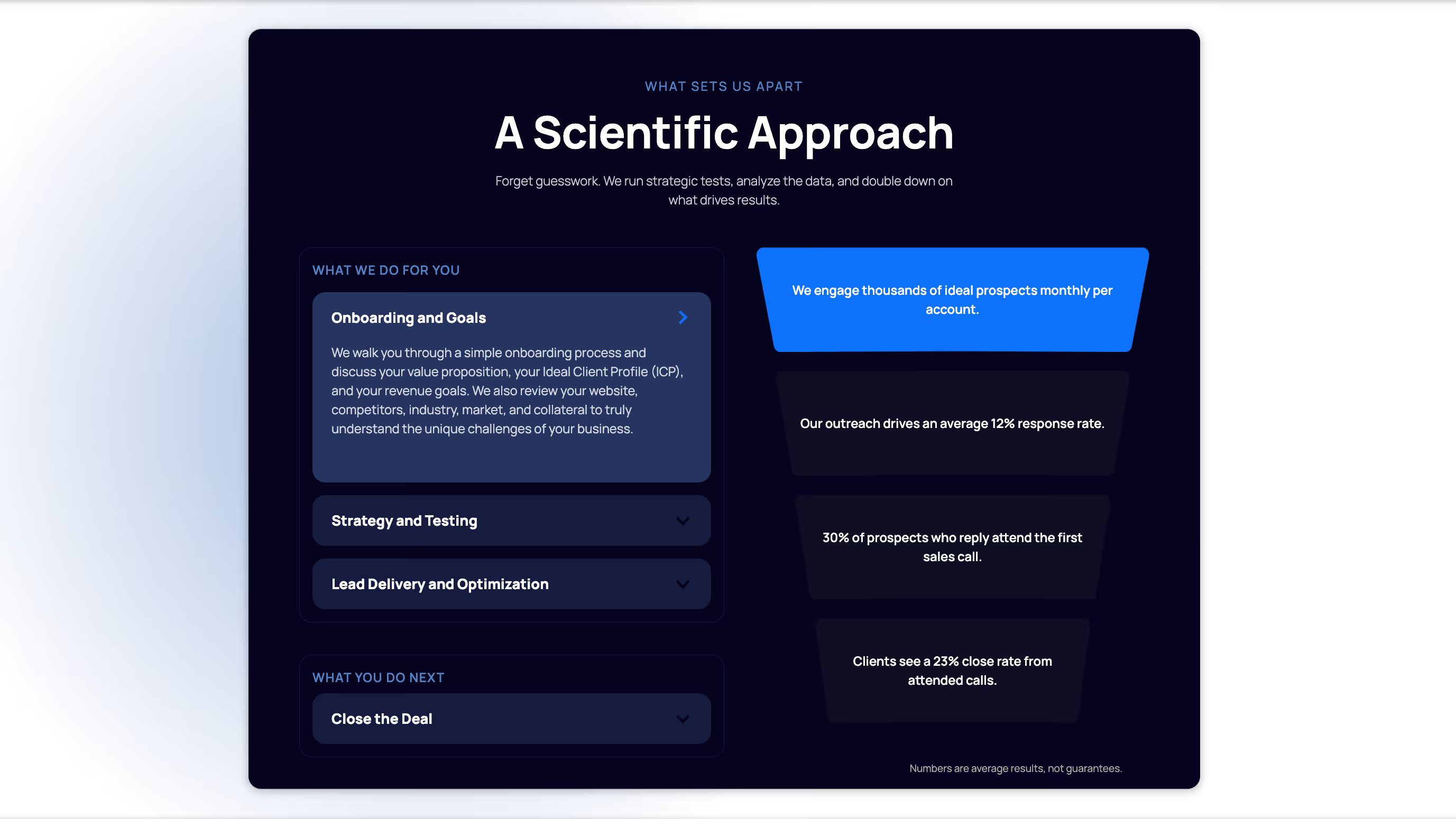
The work here was editorial as much as it was structural. Many decisions centered around what to foreground, what to subordinate, and what to cut entirely. Services were reframed around what each client was trying to achieve rather than what Wyspur was technically capable of delivering. The site didn’t get shorter so much as sharper. Every element that remained had a clear job.

03. Conviction, Sequenced
For high-touch B2B businesses, the homepage has a specific job: to move a serious buyer from arrival to inquiry without losing them to ambiguity. Sequencing determines how well your site can do that. Each section has to answer the question a prospect is actually asking in that moment, in the right order, before they’ve had to ask it out loud.
That’s why we spent significant time on the homepage structure. The order of sections, what led and what followed, what established credibility before asking for buy-in, were all decisions about how conviction gets built across a single scroll. Getting the sequence wrong means the strongest proof points arrive after the reader has already made up their mind.
On a lean site, there’s nowhere to recover that ground.


04. Earning the Conclusion

There’s a version of premium web design that’s mostly aesthetic: better photography, more white space, a typeface that signals seriousness. That’s necessary but not sufficient for a service sold on the strength of judgment and results. The site has a harder job: to make the investment feel like the obvious conclusion by the time someone reaches the bottom of the page.
That means the site has to function as an argument. Not as a list of capabilities or a gallery of logos, but a structured case that moves a skeptical buyer from arrival to inquiry by answering the right questions in the right order. A prospect who arrives uncertain and leaves convinced didn’t get there because the site was beautiful. They got there because the reasoning was sound enough to move them.
That’s what we built toward: a site that earns its conclusion rather than just presenting one.


Up Next


Built to Evolve