UASSIST.ME

Buyer-first architecture
Winter 2025
Capy
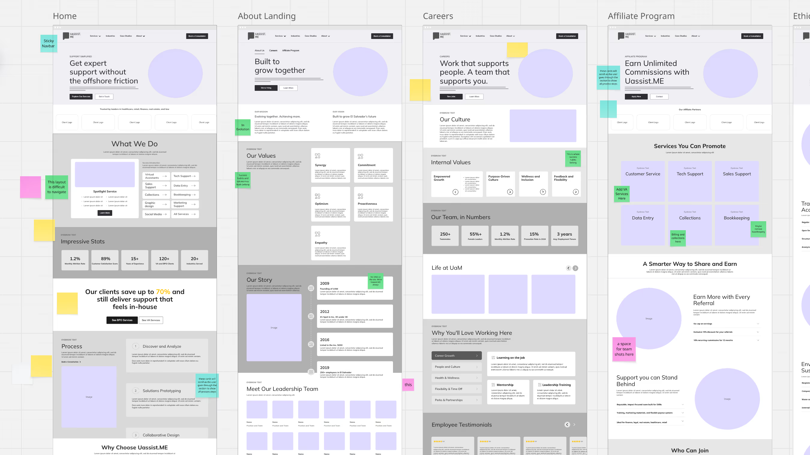
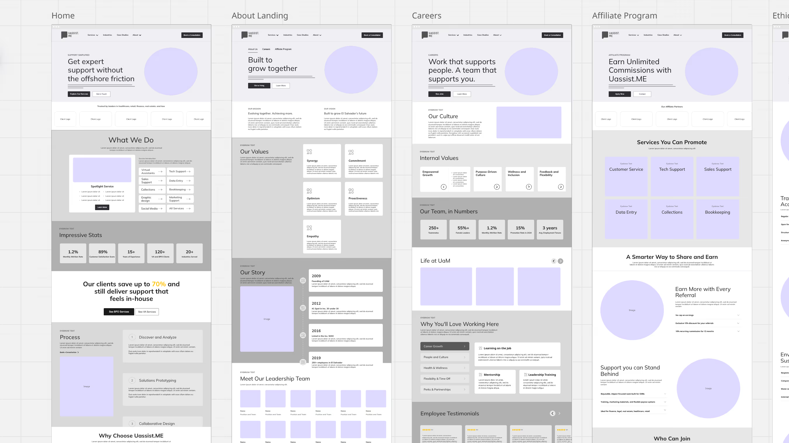
A multi-column website wireframe layout showing five main sections titled Home, About Landing, Careers, Affiliate Program, with colored highlights, graphs, and placeholders for images, illustrating a structured website design with leadership bios, values, services, stats, and customer support options.Screenshot of a website layout with multiple sections including Home, About Landing, Careers, Affiliate Program, and others, each featuring headings, text blocks, charts, icons, and images arranged in columns.

UassistME had served more than 1,000 companies across North America. As the business grew, the site absorbed each new service and positioning shift as it arrived.

The result is what we call org-chart architecture: a site based on an organization's internal structure. This approach tends to produce websites that require buyers to understand how a business sees itself before they can identify and choose among its offerings. In other words, the primary obstacle was structural.

The usual brief at this stage is modernization. But redesigns rarely address structural issues. For us the first order was clarity: what does this site need to communicate, to whom, and in what order?

Three people seated at a wooden table in a bright, modern workspace with large windows and colorful abstract art on the wall, working on laptops.

UassistME serves a wide range of client types. The site asked each of them to self-sort.

The old site had one page for each industry it served, but it described the industry and stopped.

Follow a buyer through it and they sort themselves twice. First, on the home page, they look for proof the firm has worked in their industry. Then, once they find their industry page, it ends, and they have to back out and search for the services they came for. Two detours before the buyer reaches what they came for means two chances to leave.

Instead, we mapped five buyer journeys and built each one from landing to conversion. Each follows the order in which buyers ask questions, so the next answer is always the next thing on the page.

The nav went from 25 items, 11 of them three clicks deep, to 17 across five paths. No major conversion point is more than two clicks from home.


Website header with logo reading 'Uassist.Me' in yellow, navigation menu with links for Services, Industries, Case Studies, About, a teal button labeled 'Book a Consultation,' and a white button labeled 'Careers.'
Navbar
Onboarding Process
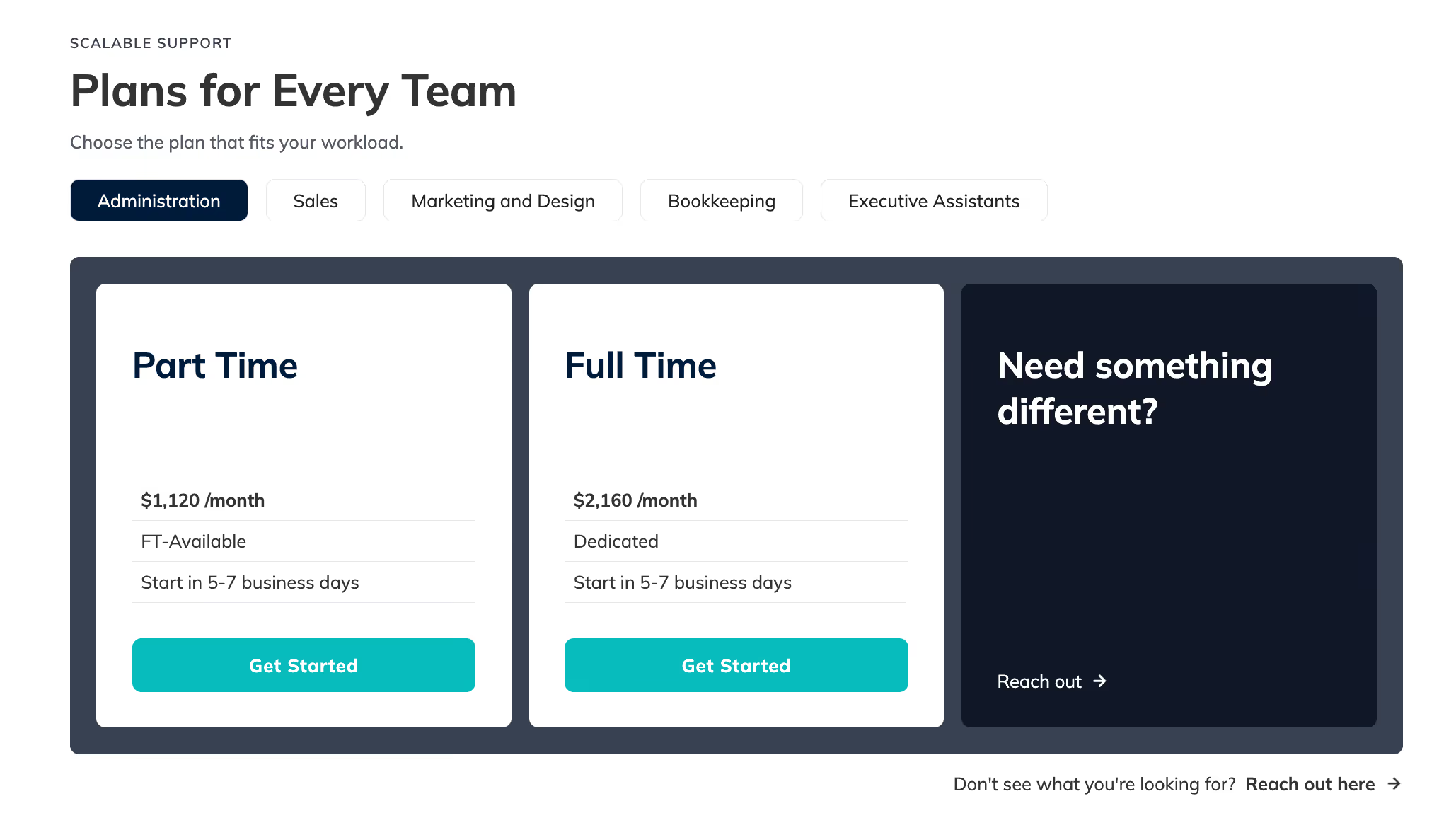
Pricing plans for administration teams with two options: Part Time at $1,120/month, FT available, starts in 5-7 business days; Full Time at $2,160/month, dedicated, starts in 5-7 business days. Both have a teal Get Started button. A dark box on the right asks if the user needs something different with a prompt to reach out. Tabs for other team categories include Sales, Marketing and Design, Bookkeeping, and Executive Assistants.
Package Card
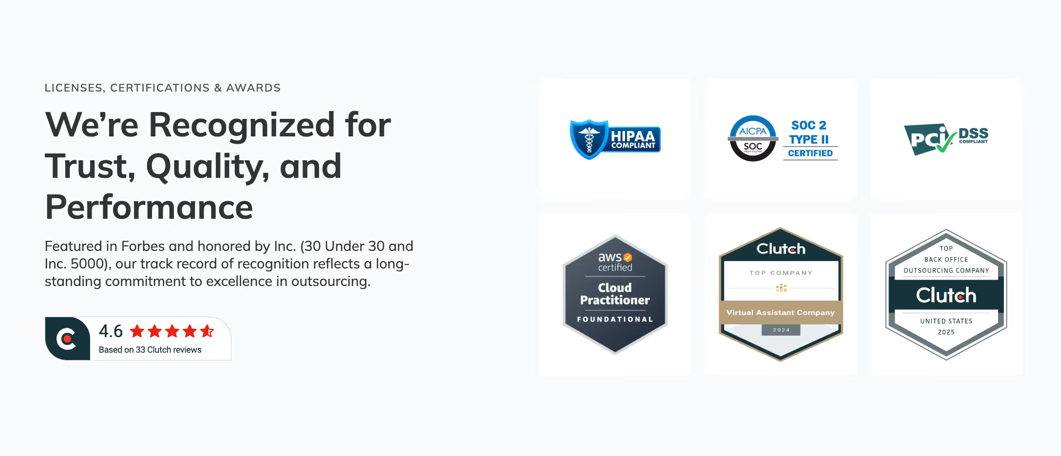
Section highlighting trust, quality, and performance recognition.
Navbar
Certifications Grid
Counting Stats
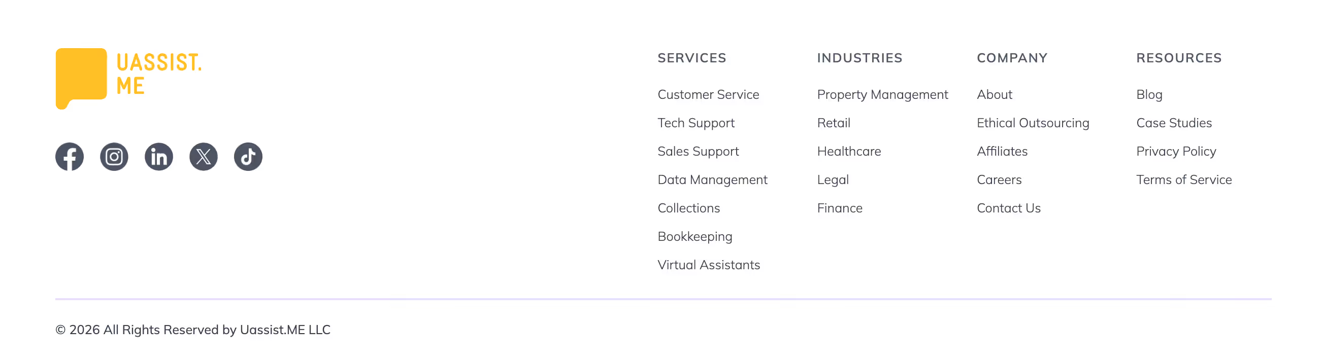
Footer section of a website showing Uassist.Me logo, social media icons for Facebook, Instagram, LinkedIn, X, and TikTok, and columns of links labeled Services, Industries, Company, and Resources with various related topics under each. Copyright notice for 2026 by Uassist.ME LLC is at the bottom.
Footer
Logo Carousel
FAQ Dropdown

A structure like this only lasts if the people running it can keep it intact. UassistME has its own marketing and web team, so we built for their ownership. Every decision was weighed against one question: can this team run the site at the pace they actually work, without calling us?

Templates let marketing publish without touching structure. The case study library went from zero to nine at launch and is still growing.

A growing library needs somewhere to go. The blog had eight categories, mixing industry, service type, format, and company news. Every post had to be forced into one, and every reader had to guess where to look.

We replaced them with three filters (topic, industry, and service) plus keyword search. It's the same logic as the nav, applied to content: posts are tagged the way buyers search, so the library grows without new categories.
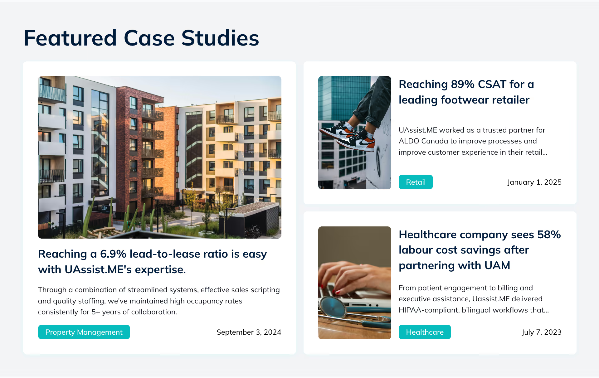

A section titled 'Featured Case Studies' showing three case studies with images and brief descriptions: 1) A photo of modern apartment buildings with the caption 'Reaching a 6.9% lead-to-lease ratio is easy with UAssist.ME’s expertise.' and a description about high occupancy rates, dated September 3, 2024, labeled Property Management. 2) A photo of a person wearing sneakers sitting on a bench, captioned 'Reaching 89% CSAT for a leading footwear retailer' with a brief description and date January 1, 2025, labeled Retail. 3) A photo of hands typing on a laptop with sunglasses nearby, captioned 'Healthcare company sees 58% labour cost savings after partnering with UAM' with a short description, dated July 7, 2023, labeled Healthcare.
Bright modern office interior with rows of desks and colorful ergonomic chairs in orange, yellow, and blue, each desk equipped with monitors and surrounded by numerous potted plants, large windows along one side, and wood shelving filled with books and plants on the right wall.