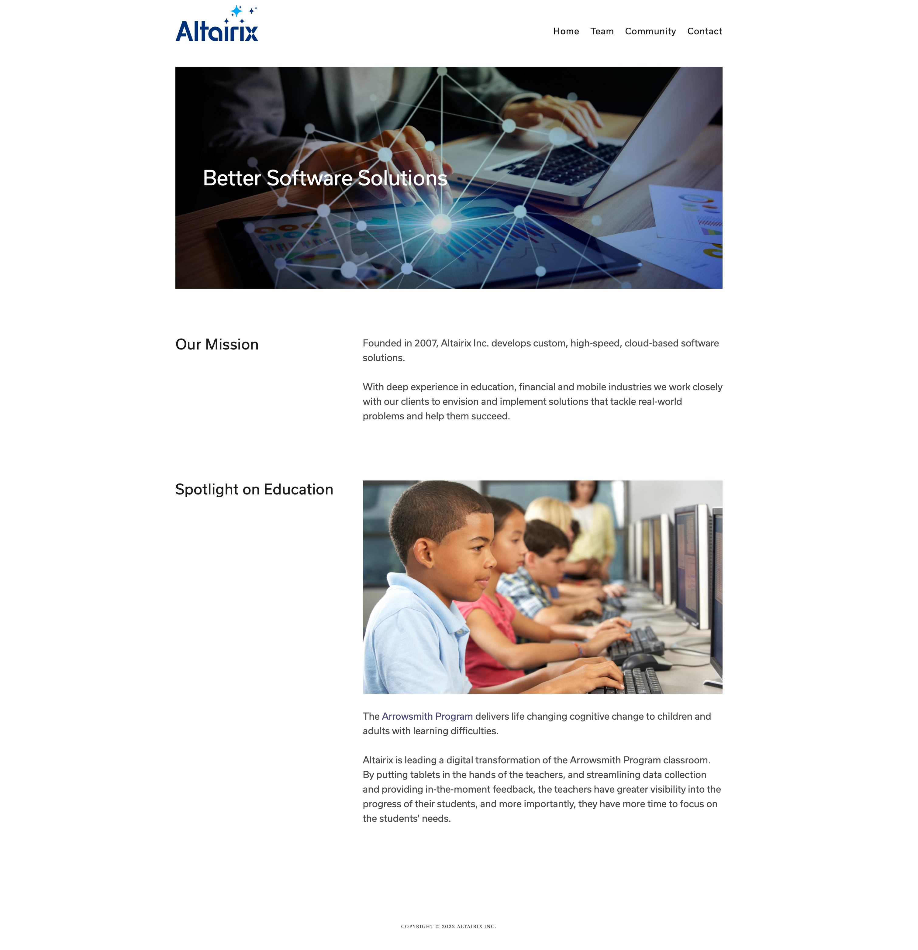

As a dynamic software company, Altairix needs a lot from its website. The perfect site connects Altairix with new projects, and finds the employees to work on them. Altairix's two groups of users were considered at every stage of the design process. A strategically redesigned information architecture was implemented to divide and guide each group of users quickly and intuitely to the information they need. This iterative method allowed Capy to develop a usable site for all visitors, tailoring each page to its target user.
Altairix’s internship program cultivates software talent from top Ontario universities. A major focus of the site redesign was to broaden the program's reach and accessibility, attracting a wider pool of student applicants. A dedicated students page makes it easy for students to learn more about the company and connect directly for opportunities.
Lorem ipsum dolor sit amet, consectetur adipiscing elit. Suspendisse varius enim in eros elementum tristique. Duis cursus, mi quis viverra ornare, eros dolor interdum nulla, ut commodo diam libero vitae erat. Aenean faucibus nibh et justo cursus id rutrum lorem imperdiet. Nunc ut sem vitae risus tristique posuere.
Accessibility is always front of mind, giving Altairix's content the widest possible reach. Capy brings attention to detail in all its work via alt. text, font legibility, and screen-reader friendly page structure.
Clear and concise copy takes centre stage on most of the Altairix site. With a clientele of mostly businesses, Capy emphasized Altairix's unique development model and competitive advantage. On pages that target potential employees, the tone changes. The site connects differently with each audience for maximum impact.
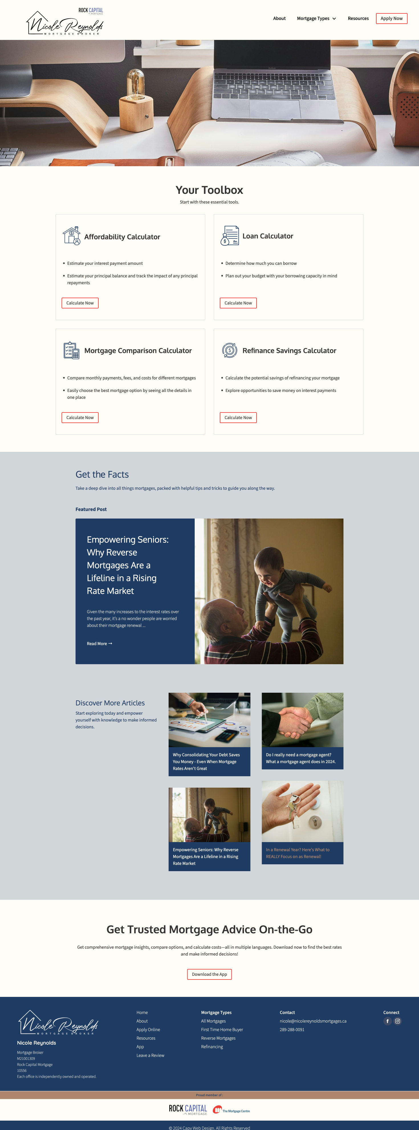
The blog serves as the backbone of Nicole’s website, attracting visitors with valuable insights into mortgages, real estate, financial planning, and market trends. Each post delivers actionable advice and expert commentary, establishing Nicole as a trusted authority in the mortgage industry. By consistently publishing high-quality content, the blog not only drives traffic but also encourages repeat visits, solidifying long-term client relationships.
Nicole’s work is all about guiding her clients through one of the most important decisions of their financial lives. A perfect site helps her do that.
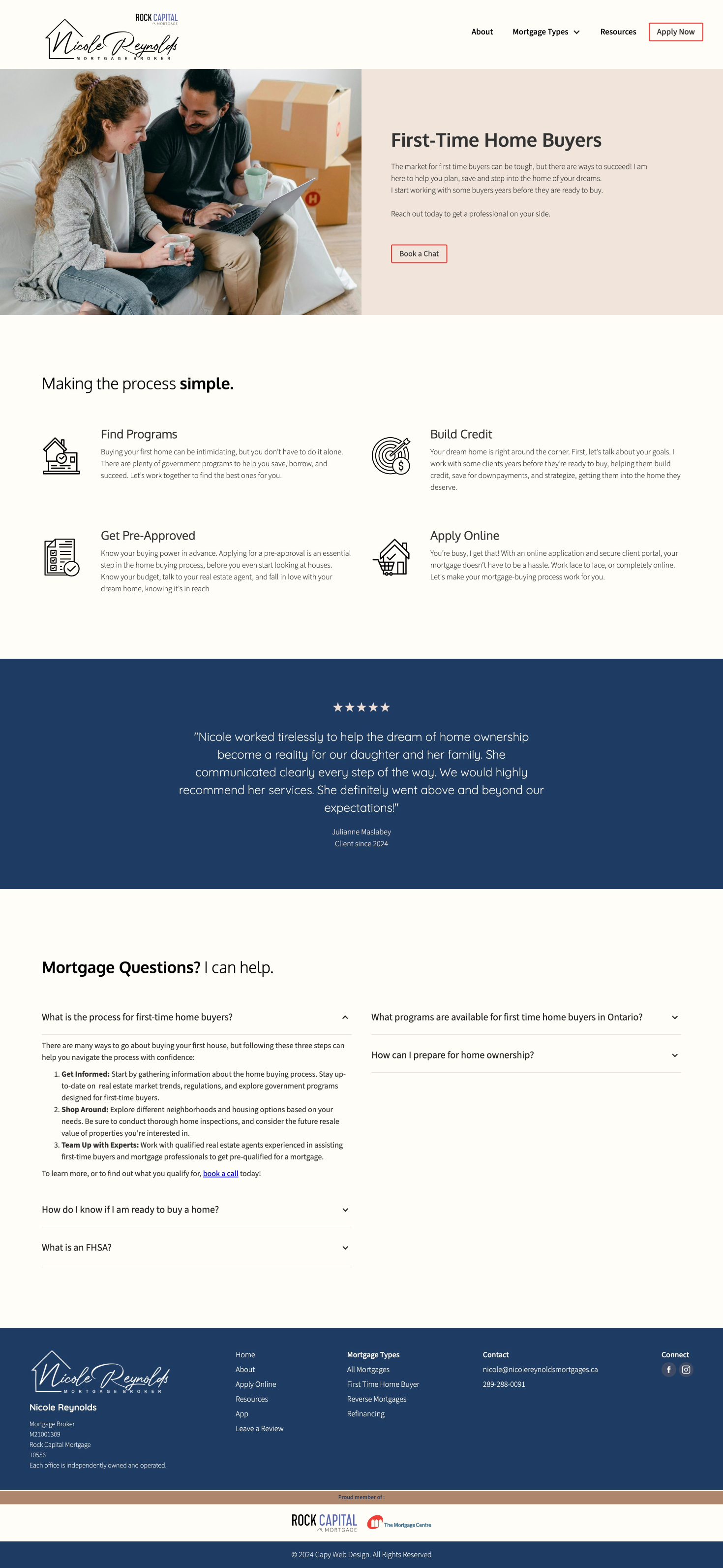
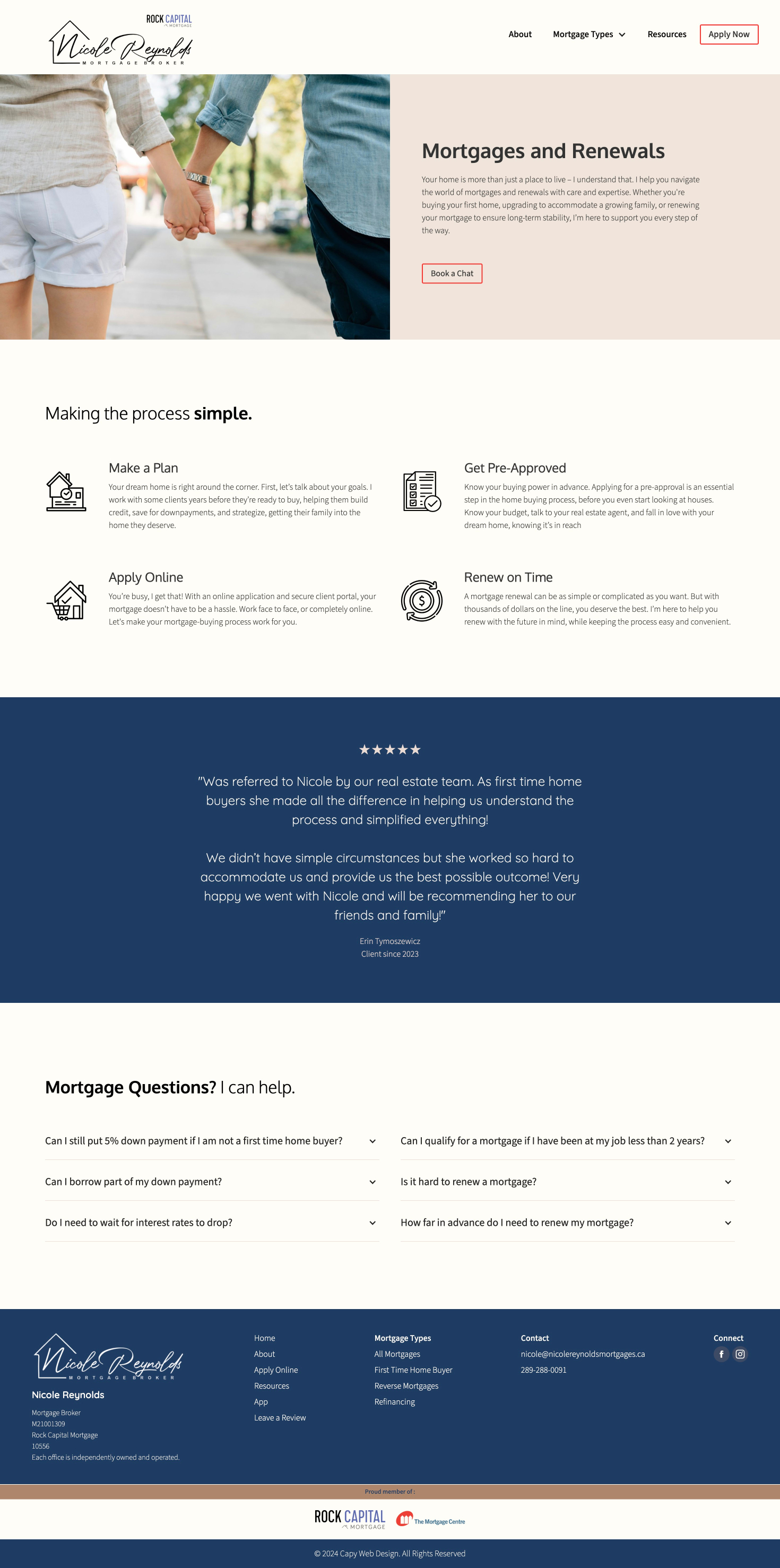
Nicole’s clients have unique needs, but all of them want to see that Nicole understands their unique situation. Through strategic categorization, well-organized FAQs, hierarchical structuring, and intuitive navigation menus, we make visitors feel understood and guide them to the information they need.
The website’s heart is an informational blog that drives traffic and provides valuable insights to clients. Blog posts cover a wide range of topics related to mortgages, real estate, financial planning, and market trends, offering actionable advice and expert commentary. By regularly publishing high-quality content, the website establishes Nicole as a trusted partner in the mortgage industry and encourages repeat visits.
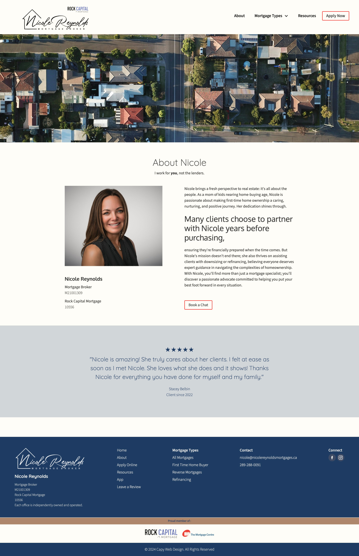
This design strikes a balance between professionalism and approachability, reflecting Nicole's expertise and friendly demeanor. From the color scheme and typography to the layout and images, every design element is thoughtfully chosen to convey professionalism, competence, and warmth
Testimonials are prominently featured throughout the website, showcasing the positive experiences of past clients and displaying Nicole's commitment to excellence and client satisfaction. These testimonials serve as social proof of Nicole's expertise, reliability, and personal dedication to her clients, helping to build trust and credibility.
Throughout the website, calls-to-action (CTAs) are strategically placed to encourage visitors to take the next step in their journey, whether it's scheduling a consultation call with Nicole, downloading a free resource, or following her on one of her social media platforms.
Increased site visibility through organic keyword SEO, clean information architecture, and attention to detail in structural factors.
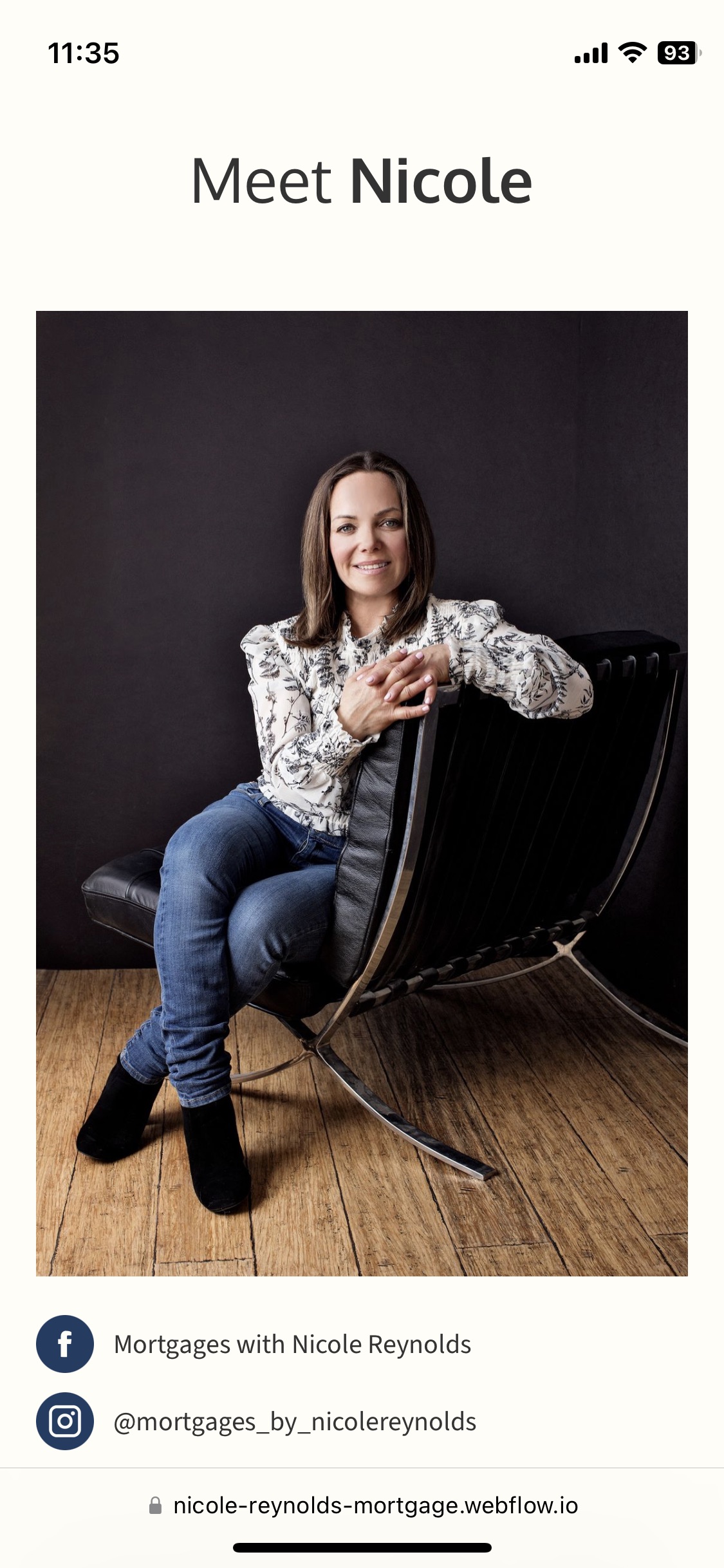
In today's mobile-centric world, Nicole's website is optimized for seamless performance across all devices and screen sizes. Whether visitors are browsing on a desktop computer, tablet, or smartphone, this ensures that all clients can easily find the information they need.
