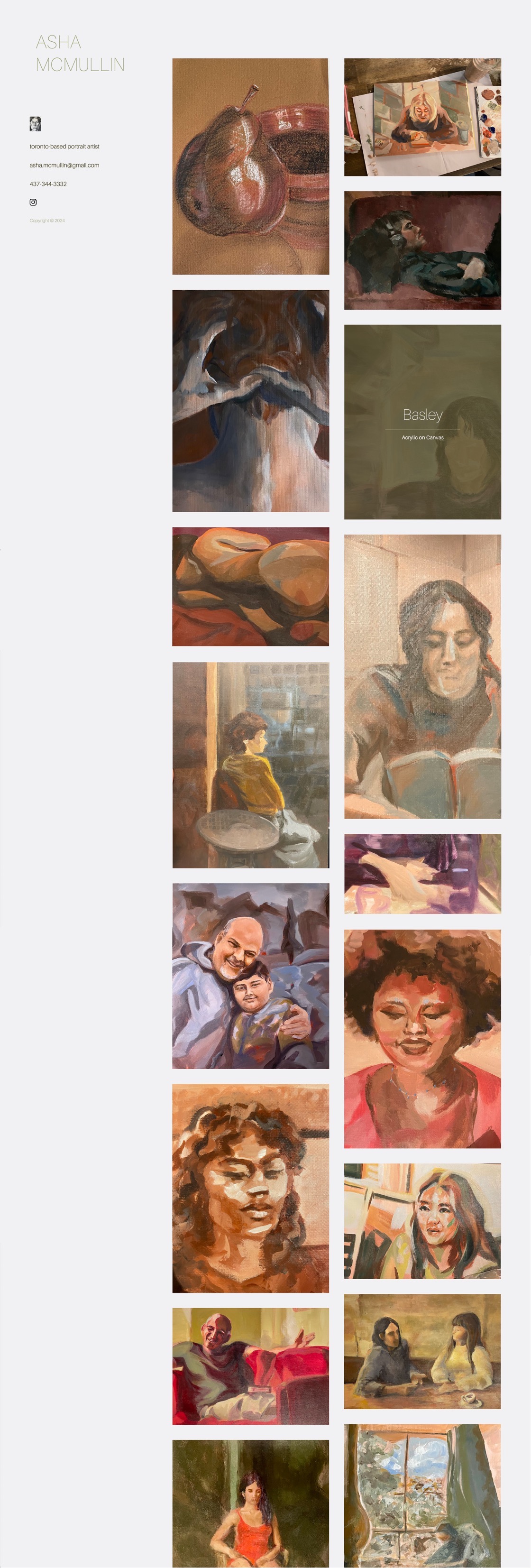
Prior to diving into her website project, Asha struggled with the constraints of social media platforms, where her best work often remained hidden under the noise of algorithms and the relentless pressure to post. Reclaiming control over her artistic narrative, we worked together to build a space where her creativity could truly shine.
This website serves as a haven of artistic control, where everything you see is a deliberate choice by the artist and the Capy design team to show her work off at its best.
Ignore the website, remember the art.
Unlike business sites, which are designed to generate sales and make contacts, this site is all about showing off. It works like a business card, turning offline contacts into potential patrons and getting viewers interested in exciting future projects.
Capy helps establish the artist's style and brand by getting the art in front of the viewer with no distractions.


Strategically designed information architecture to keep visitors on track.
Refreshed UX design making relevant information easily accessible and guiding visitors naturally to CTAs
Keeping focus on the art with a minimal, modern look
Increased site visibility through organic keyword SEO, clean information architecture, and attention to detail in structural factors.
Leveraged client base to build trust, created a design emphasizing responsiveness, accessibility, and navigability.