Webflow
Krita
Netlify
Responsive Website Design, Web Hosting, Web Security, User Experience (UX) Design, Digital Brand Identity, Information Architecture Overhaul, Custom Graphic Design, SEO Copywriting, Technical SEO
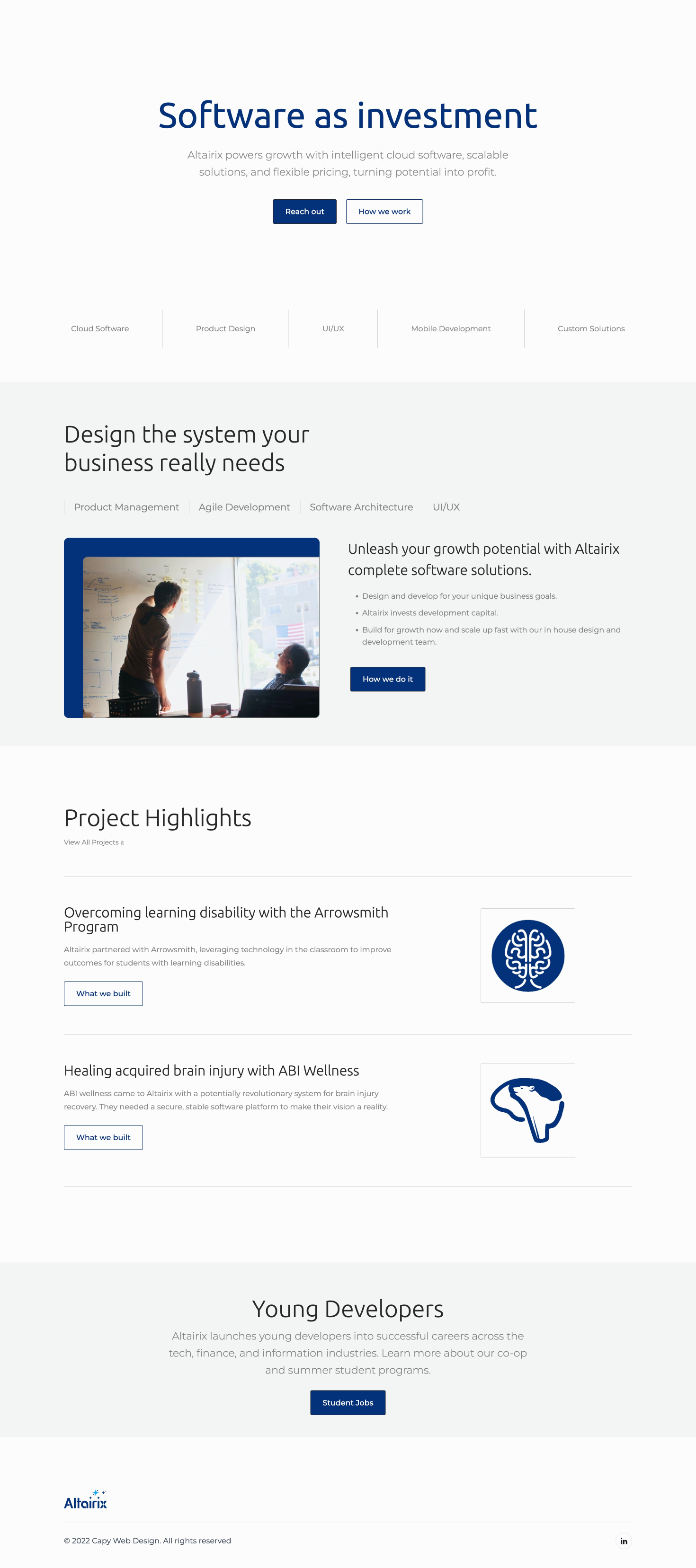
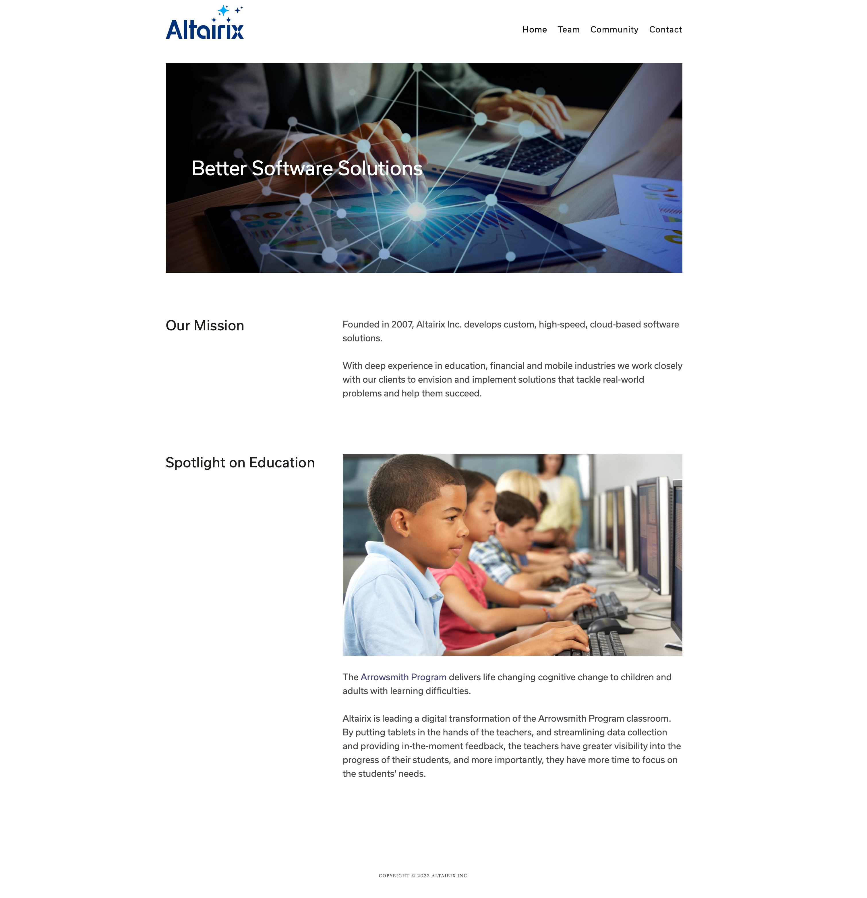
As a dynamic software company, Altairix needs a lot from its website. The perfect site connects Altairix with new projects, and finds the employees to work on them. Altairix's two groups of users were considered at every stage of the design process. A strategically redesigned information architecture was implemented to divide and guide each group of users quickly and intuitely to the information they need. This iterative method allowed Capy to develop a usable site for all visitors, tailoring each page to its target user.
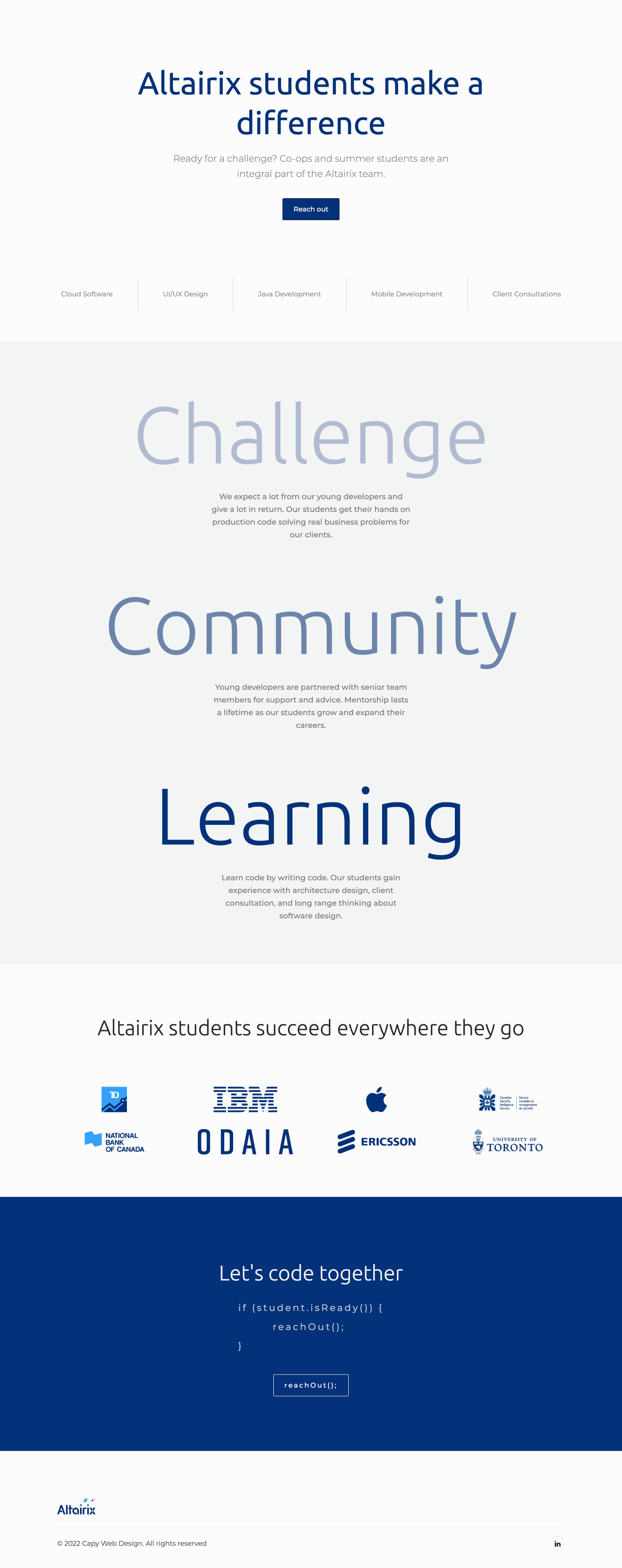
Altairix’s internship program cultivates software talent from top Ontario universities. A major focus of the site redesign was to broaden the program's reach and accessibility, attracting a wider pool of student applicants. A dedicated students page makes it easy for students to learn more about the company and connect directly for opportunities.
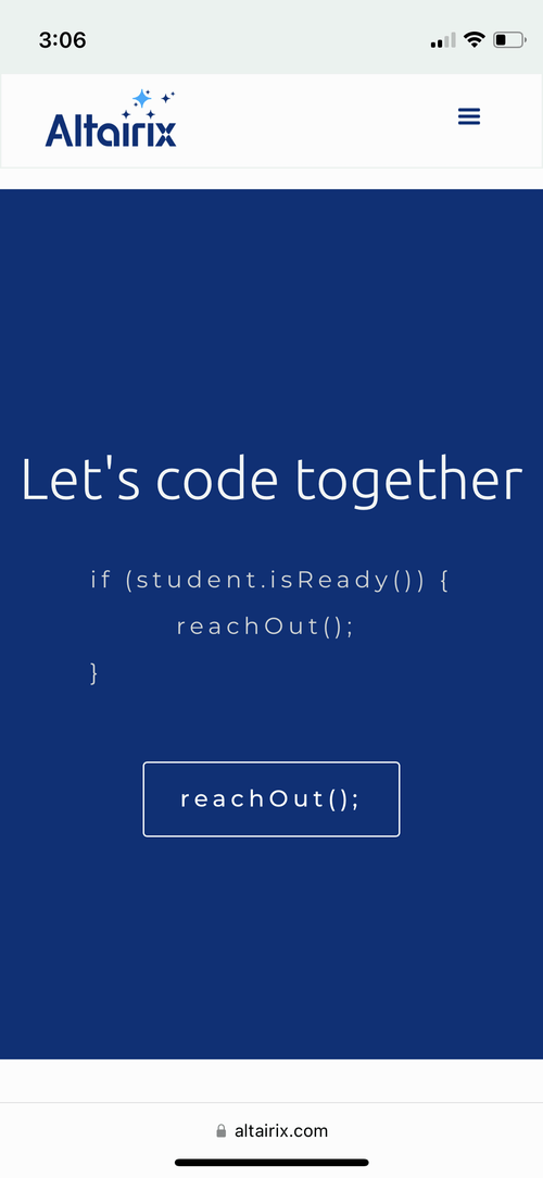
Altairix’s new site is fully responsive, ensuring a consistent, high-quality experience across all devices. Designed for agility, the site adapts effortlessly to desktops, tablets, and mobiles, reflecting Altairix's commitment to delivering scalable software solutions.

Accessibility is always front of mind, giving Altairix's content the widest possible reach. Capy brings attention to detail in all its work via alt. text, font legibility, and screen-reader friendly page structure.
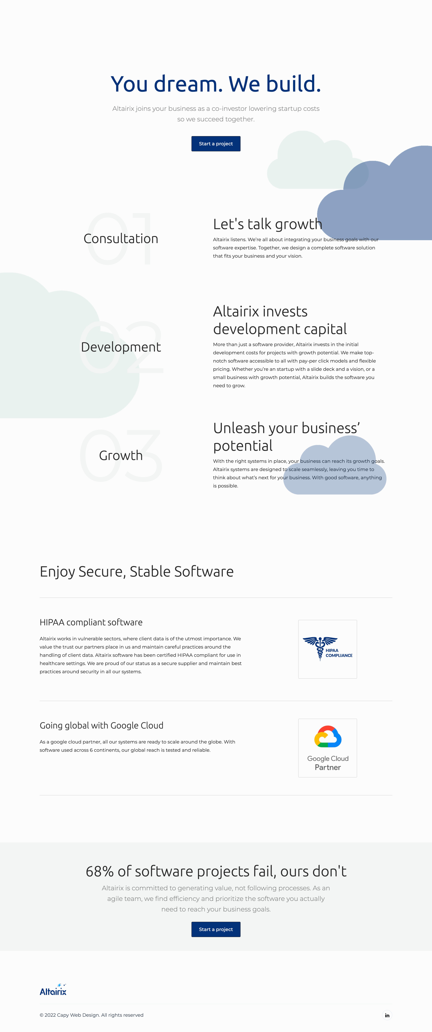
Clear and concise copy takes centre stage on most of the Altairix site. With a clientele of mostly businesses, Capy emphasized Altairix's unique development model and competitive advantage. On pages that target potential employees, the tone changes. The site connects differently with each audience for maximum impact.
